
FreshTrack
Introduction
Problem Definition & Research Area
The Problem
To ensure I was addressing real user needs, I began by conducting qualitative user research, focusing on understanding the frustrations of everyday grocery management. I interviewed 20 potential users, including busy professionals, parents, and eco-conscious shoppers. Their feedback revealed three major pain points:
Complex Interfaces:
Many existing grocery apps are cluttered and difficult to navigate, resulting in low engagement.
Pantry Management:
Users struggle to keep track of pantry items, leading to over-purchasing and food waste.Budget Constraints:
People want to stick to a budget but often end up overspending without real-time expense tracking tools.
לעצב את החלק הזה

FreshTrack's Competitive Edge
What Sets FreshTrack Apart
While there are several grocery apps on the market, most focus on only one aspect of grocery management. FreshTrack stands out by offering an all-in-one solution
לעצב
FeatureFreshTrackOut of MilkAnyListBring!YummlyCozi
AI-Generated Smart Lists✔✘✘✘✘✘
Real-Time Budget Tracking✔✘✘✘✘✘
Pantry Inventory Management✔✘✘✘✘✘
Sustainability Insights✔✘✘✘✘✘
Collaborative List Sharing✔✔✔✔✘✔
Recipe Integration✔✘✔✘✔✘
לעצב טבלה
User Personas
To guide my design decisions, I created two detailed user personas:
Sasha – The Busy Professional
Demographics: 32 years old, single, works full-time in tech.
Goals:
Save time on grocery shopping.
Minimize duplicate purchases.
Frustrations:
Often forgets what’s already at home.
Finds existing grocery apps too cluttered and time-consuming.
Amit – The Eco-Conscious Parent
Demographics: 40 years old, married with two kids.
Goals:
Reduce food waste.
Stay within a strict grocery budget.
Frustrations:
Finds it difficult to track what’s in the pantry.
Frequently overspends without realizing it.

These personas kept me focused on solving real-world problems and ensured that my design decisions were user-centered.
Sketching and Wireframing
With Emma and David’s needs in mind, I moved on to the ideation phase. I began by sketching rough ideas and concepts, focusing on key features:
Smart Lists: Automatically generated shopping lists based on pantry inventory and user preferences.
Pantry Management: A dashboard displaying items, quantities, and expiration dates.
Budget Tracking: A visual summary of real-time expenses during shopping.
Sustainability Insights: Personalized tips and metrics to reduce waste.
תמונה של סקטצ'ים
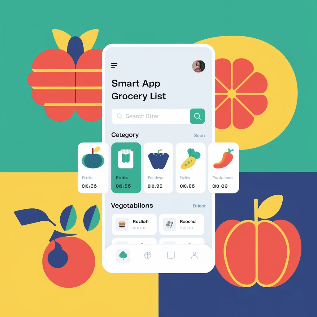
Low-Fidelity Wireframes
I translated these sketches into low-fidelity wireframes, which allowed me to map out key user flows and gather early feedback. Key wireframes included:
Homepage with a Smart List Preview: A quick view of recommended items to buy based on current pantry stock.
Pantry Dashboard: An easy-to-navigate interface showing all stored items, expiration dates, and usage suggestions.
Budget Tracker: A dedicated screen with real-time spending updates, alerts, and insights.
Sustainability Insights: Encourages eco-friendly habits by providing metrics on waste reduction.
תמונה של low fidelity wireframes
Prototyping and Iteration
My initial prototype was built with a minimalist design in mind, emphasizing usability over complexity. I tested it with a group of five users, who provided critical feedback:
Iteration 1
Feedback: Users wanted faster access to the budget tracker.
Change: We added a quick-access button for budget tracking on the main screen.
Iteration 2
Feedback: The pantry dashboard felt cluttered with too many details.
Change: We simplified the display, using icons and color coding to highlight key information like expiring items.
Iteration 3
Feedback: Users loved the sustainability insights but wanted them to be more actionable.
Change: We added personalized tips and reminders to reduce waste based on the user’s shopping patterns.
These iterations ensured that the final design was intuitive, user-friendly, and genuinely helpful.
תמונה של העיצוב אחרי השינויים
Visual Design
Reflecting FreshTrack's Purpose and User Needs
The visual design of FreshTrack wasn’t simply about aesthetics—it was driven by a combination of user research, market trends, and the app’s core values:
simplicity, sustainability, and empowerment.
לעצב באייקונים
Clean and Modern Aesthetic
My research revealed that users preferred apps with a clean and minimal interface. Cluttered designs often overwhelm users, especially when dealing with complex tasks like grocery management. I chose a clean and modern aesthetic to create a calming experience that helps users focus on what matters most: their grocery lists, budgets, and pantry.
תמונה
Minimalistic layouts: To reduce cognitive load and make navigation effortless.
Ample white space: Ensures clarity and helps users quickly scan through lists and dashboards.
Color Palette Inspired by Freshness and Sustainability
The color palette was carefully selected to reflect the app’s core values:
Green (#4CAF50): Represents eco-conscious living and sustainability, aligning with the app’s goal to reduce waste.
Teal (#009688): Evokes calmness, trust, and a sense of reliability—critical for a tool people will use regularly.
Yellow (#F4C542): Adds energy and optimism, creating a sense of achievement when users track progress or stay on budget.
Orange (#FF6F61): Draws attention to important actions, such as budget alerts or expiring pantry items.
Navy (#203152): Adds balance and depth, giving the app a professional and polished look.
לעצב
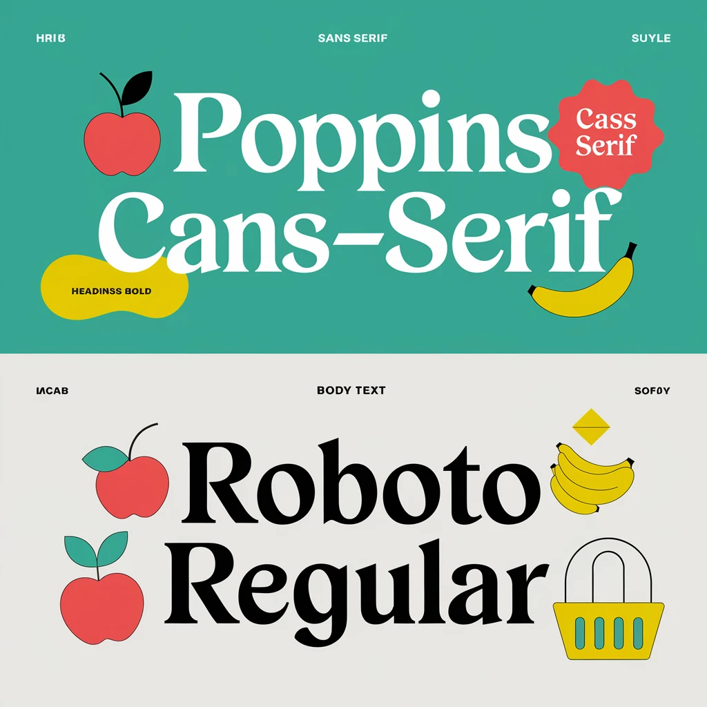
Typography: Balance Between Readability and Personality
Given the app’s broad target audience, from busy professionals to parents, I needed a typeface that was clear for quick reading but still had a bit of personality to keep it engaging. This combination enhances the app’s usability across different devices and screen sizes.
Poppins Bold: A sans-serif font with a clean and slightly rounded style, which adds a friendly yet professional feel to the app.
Roboto Regular: A widely used, highly legible font that ensures users can easily read lists, metrics, and tips.
לעצב
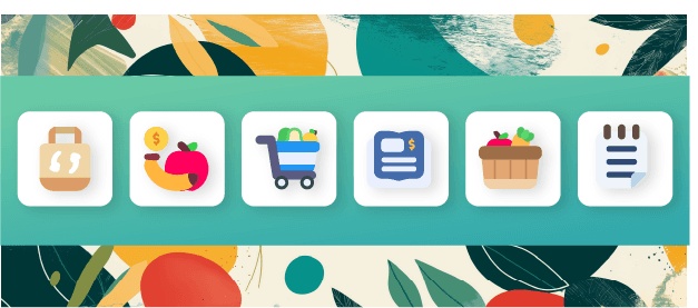
Iconography and Visual Elements
I designed custom icons and visual elements to make navigation intuitive. Each icon was crafted to be easily recognizable, helping users quickly identify features such as the pantry, budget tracker, and smart lists.
Simplicity in Icons:
Rounded edges and simple lines were used to maintain the clean and modern aesthetic.
Consistent icon size and style ensure a cohesive look throughout the app.
לעצב
Results & The Takeaway
After multiple iterations and rounds of feedback, I reached a point where users reported significant improvements in their grocery management. some mentioned that they now shops with confidence, knowing exactly what they need, while others appreciated the reduction in food waste and better control over their budget.
Impact
Increased Efficiency: Users reported saving up to 20 minutes per shopping trip.
Reduced Waste: Over 60% of users noted a reduction in expired items at home.
Improved Budget Control: Users stayed within their budgets more consistently.
לעצב דיאגרמה
Lessons Learned
Empathy Drives Design: Understanding users’ pain points deeply influenced our design decisions.
Iteration is Key: Every round of feedback improved the product.
Simplicity Wins: A clean, intuitive interface led to higher user satisfaction.
לעצב
FreshTrack isn’t just another grocery app—it’s a personalized, user-centered solution that simplifies grocery management while promoting sustainability. This case study highlights how thoughtful design, grounded in empathy and iteration, can solve real-world problems and deliver meaningful value.