- Company
- Vee · Grant + Maggie
- Role
- Product Designer · research to code
- Timeline
- 2026
- Scope
- Every AI action, chat + page
- Outcome
- Chat usage +38%
In-Context Editing
Designing how Vee’s AI agents behave, and turning competing visions for the product into one set of rules our users could actually take on.
Project overview
The question wasn’t whether AI could do the work. It was how it should behave while doing it.
Vee builds AI agents for nonprofits: Grant writes grant applications, Maggie runs social media. In 2026 the company aimed for autopilot, agents that do more of the work on their own.
That raised a hard design question: how should an agent show what it’s doing, ask before it acts, and let you take it back? Every feature answered it differently, so the two agents felt like two different products.
I researched the options, my own included, and let the evidence push back. I chose not to turn the product into a chat, and brought AI into the pages people already used, with doors into the chat. Then I wrote one set of rules for every kind of AI action, designed the flows, and refined the shipped components in code.
My role
From the first question to the shipped component
- Led the research. Designed the method and made every call on what the evidence meant.
- Set the direction. Chose the path for where our users and the business were.
- Wrote the rules. Six action types, seven rules, and the docs the team designs against.
- Designed every flow. Chat and page, Grant and Maggie.
- Refined it in code. The UX and design of the shipped chat and page components, with Claude.
The situation
Every direction was valid
AI was moving fast, and so were opinions about Vee’s future. Everyone on the team had a vision, me included, and you could point to good AI products built on each one.
So the question wasn’t “which idea is good?”. It was which one fits our users, at the stage our business is in? Some ideas, chat-first especially, were drastic. I needed a way to choose that didn’t come down to whoever argued loudest, including me.
Who we design for
Experts with habits, moving upmarket
Our daily users are Grants Managers and Communications Managers at nonprofits with $1M+ in revenue. They’re experienced, already work in tools like Instrumentl, Salesforce and Canva, and judge every AI output against their own expertise: permanently skeptical experts.
Vee was moving upmarket toward exactly these organizations, so whatever we chose had to work for people with established habits and high standards.
The research
Research built to disagree with me
Research into “how do other products do it” tends to turn into a shopping list: one product does something elegantly, so we should too. I set mine up to push back instead:
- I didn’t record a prediction, so I couldn’t steer the results toward one.
- My own rules were hidden from the research agents, so they recorded what products actually do, not whether my rules held up. Every promising pattern was then argued twice: one agent made the case for adopting it, another the case against, neither knowing about the other.
- A midpoint check, with stop-or-continue criteria written before any evidence came in.
The agents did the volume, from legal and finance tools to code editors and consumer apps. The method, and every call on what the evidence meant, were mine.
The turning point
The midpoint check proved me wrong
I’d organized the research around an assumption: products built around AI from day one handle these moments differently from established tools that added AI later. The difference wasn’t really there. What shaped each product’s choices was the work itself: how big it was, how risky, and whether it could be undone.
That changed how I saw my own vision. The patterns I admired worked for AI-native tools and their users. They didn’t automatically transfer to experienced grant writers reviewing documents a funder will judge. My view had been too radical for our users.
The finding that shaped everything after it: the amount of review should match the risk. Asking people to approve every AI-written answer on a 100-question form sounds safe. In practice, approvals outpace reading, and people start clicking without looking.

The decision
No 180° turn
For our users, and for where the business was, turning the product into a chat would have been confusing and counterproductive. We’d be asking experts to give up workflows they’d spent years building.
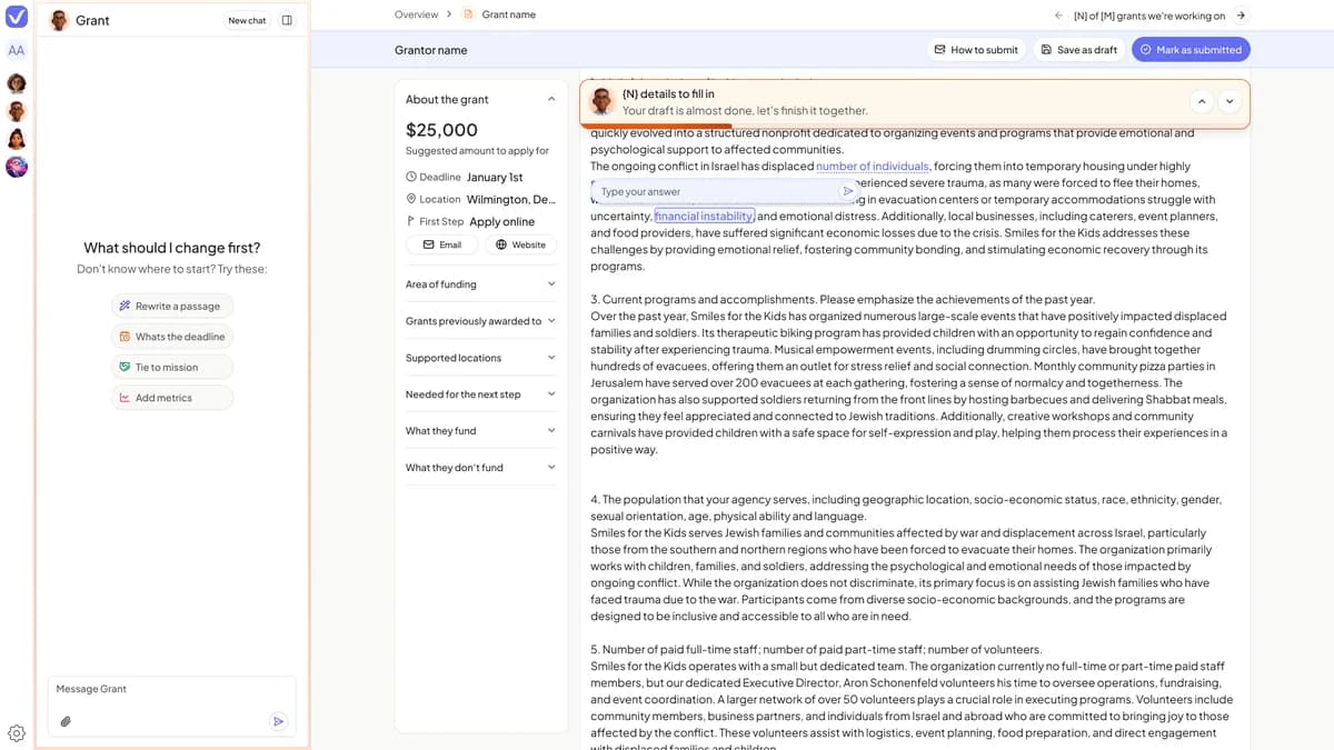
So I put as much AI as possible on the page people already know, alongside a chat, and strengthened everything that leads into the chat:
- Modify, right where you are. Select text, or hit Modify on a whole answer, and the AI options open in place. One more option, Add to chat, hands it over to the conversation.
- A highlighted line goes to the chat as a reference, so you never re-explain what you mean.
The best AI feature is often an existing feature with a door into the agent.
Nothing people knew was taken away, but every habit became an entry point to the chat.
The rules
One set of rules for every AI action
Every new AI feature reopened the same questions. Preview before the change or after? Undo? Ask first or just act? A caption edit, a letter rewrite and a form answer were each designed separately, and each got a slightly different answer.
So I stopped answering per feature and defined the rules once per type of action. Every AI interaction at Vee is one of six things done to the user’s work:
Each type is defined twice: in the chat and on the page. Seven rules apply across all of them. Three carry the most weight:
Nothing changes silently.
And undo is visible, not hidden.
However much the agent is trusted.
The hardest tension was between autopilot and trust: autopilot means seeing less, trust means seeing everything. The rules resolve it by timing, not presence. While trust is low, the preview comes before the action. As it grows, it comes after: “I changed X. Here it is, want to undo?” It never disappears.
The rules live in our product docs next to a database of every AI interaction across both agents. The test I set: a new AI feature should find its answers by looking them up, not by holding a meeting. Design briefs are reviewed pass/fail against the rules, not by discussion.
The designs
One set of rules, two ways in
Real usage showed what happens when nobody designs the behavior. Over four weeks of Maggie conversations (174 sessions, 71 organizations), the chat had no idea which page you were on. 70% of the times it handed off to a human, it was for a command it could have done itself. “Add my name” got back “What name should I add?”
None of this was a bug. The agent did what it was built to do. No one had decided how it should behave when the answer was already in your data, or what it should know about the page you were on. Those are product design decisions, and they were the gap the rules had to close.
In the designs, every flow can start in the chat or on the page, and both end the same way: working, a soft sweep over the part of the page being changed; the change, in place, old text crossed out and new text highlighted; then approve or undo.
Risk, graduated
How much the agent asks scales with risk
If several platforms are affected, it asks which ones before acting. Approving a post acts first, then reports. Deleting always gets a firm confirmation. And when a request comes in, the agent acts if the answer is in your data, offers a choice if there are two candidates, and asks one specific question only if there’s nothing to go on.
In code
Taking dev-built components further
Rules only matter if the product follows them. Our developers built the technical foundation of every chat and page component for text editing and AI conversation. Then I went into the code with Claude and worked on the UX and design of each one, making bigger changes myself or with a developer’s help.
The clearest example is the result card, what you see after the agent does something. The first version showed the agent’s internals: a card per backend call, named after the tool (“Reschedule post”), with the raw value it was called with and a “Done” badge. Moving three posts gave you three identical cards and no date you could read. It told users nothing, and non-technical users found it intimidating.
I rebuilt it around what changed for you. One card says it in plain words, shows where each post landed, and gives you a way back for each platform or all of them. Show me takes you to the change on the page. The agent’s steps still exist; they just stopped being the headline.
The outcome
The chat became part of the work
Bringing AI onto the page, with doors into the chat, strengthened people’s connection to the chat. Usage rose, and people spent far less time on edits they used to do by hand.
As the chat became part of everyday work, we moved it to the left, where people look first, to make it the focal point. Not as an end in itself: it’s one more step toward autopilot.
Reflection
At the frontier, the rules keep changing
Things moved so fast that the one thing we kept saying was: the rules are constantly changing, so our decisions, workflows and methods have to change with them.
At the frontier you’re always asking: did nobody do this because it’s bad, or because we’re the first? Does it not fit our users, or are we the first to show them this new world? That question stayed with me through the whole process, and twice my own research taught it to me by finding something I’d concluded “nobody does”.
So I can’t honestly say what I’d do differently. This world is still moving, and it’s too soon to look back and judge. What I learned is to build that question into how I work, and to build rules that can be turned, not torn down. Every rule here is a dial set for today’s level of trust. Getting to autopilot means turning the dials, not redesigning the product.
Autopilot isn’t shipped, it’s earned. You design the steps, not the destination.